안녕하세요. 혀코입니다.
이번 시간에는 JavaScript GSAP 라이브러리를 사용해서 애니메이션 효과를 추가하는 방법에 대해서 알아보겠습니다.
GSAP 라이브러리가 버전이 3으로 업그레이드 되면서, 기존 버전 2에 Tween, Timeline 플러그인등을 포함하게되었습니다.
GSAP3 CDN 링크는 아래 웹페이지에서 확인 가능합니다.
https://cdnjs.com/libraries/gsap
GSAP3를 라이브러리를 사용하기 위해서는 아래와 같이 GSAP JS 파일을 body 태그 마지막 부분에 추가 해줍니다.
GSAP3 HTML5 Boilerplate:
<!DOCTYPE html>
<html lang="en">
<head>
   <meta charset="UTF-8">
   <meta name="viewport" content="width=device-width, initial-scale=1.0">
   <title>Documents</title>
   <link rel="stylesheet" href="./src/style.css">
</head>
<body>

   <!-- GSAP JavaScript Library -->
   <script src="https://cdnjs.cloudflare.com/ajax/libs/gsap/3.4.2/gsap.min.js"></script>

   <!-- Custom JavaScript -->
   <script src="./src/custom.js"></script>
</body>
</html>
gsap.to / gsap.from / x / roation / duration
여기에 header 태그를 만들고 h1을 만들어서 헤드라인을 적어보고 gsap 라이브러리를 사용해서 애니메이션 효과를 적용해 보겠습니다.
index.html 파일을 다음과 같이 작성합니다.
<!DOCTYPE html>
<html lang="en">
<head>
   <meta charset="UTF-8">
   <meta name="viewport" content="width=device-width, initial-scale=1.0">
   <title>Documents</title>
   <link rel="stylesheet" href="./src/style.css">
</head>
<body>

   <header>
      <h1>JavaScript GSAP Library Animation</h1>
   </header>

   <!-- GSAP JavaScript Library -->
   <script src="https://cdnjs.cloudflare.com/ajax/libs/gsap/3.4.2/gsap.min.js"></script>

   <!-- Custom JavaScript -->
   <script src="./src/custom.js"></script>
</body>
</html>
style.css 파일을 다음과 같이 작성합니다.
* {
   margin: 0;
   padding: 0;
   box-sizing: border-box;
}

header {
   height: 100vh;
   display: flex;
   justify-content: center;
   align-items: center;
}
custom.js 파일을 다음과 같이 작성합니다.
gsap.to('header h1', {x: 400, rotation: 360, duration: 3});gsap.to를 사용하면, 애니메이션이 앞으로 어떻게 될지에 대해서 정의할 수가 있습니다.
x 값을 400으로 정의하면, 오른쪽으로 400px을 이동하게 됩니다.
rotation 값을 360으로 정의하면, 한바퀴를 회전하게 됩니다.
duration 값을 3으로 정의하면, 애니메이션이 3초에 걸쳐 진행이됩니다.
preview:

그럼 gsap.to 대신 gsap.from으로 적으면 어떻게 작동할까요?
custom.js 파일을 다음과 같이 변경합니다.
gsap.from('header h1', {x: 400, rotation: 360, duration: 3});
preview:

x값이 오른쪽으로 400px 위치한 곳에서부터 애니메이션이 시작되어 정해진 위치로 3초동안 한번 회전하며 이동하는 것을 확인할 수 있습니다.
이번에는 여러개의 태그를 추가시키고 애니메이션을 적용해 보겠습니다.
index.html 파일을 다음과 같이 작성합니다.
<!DOCTYPE html>
<html lang="en">
<head>
<meta charset="UTF-8">
<meta name="viewport" content="width=device-width, initial-scale=1.0">
<title>Documents</title>
<link rel="stylesheet" href="./src/style.css">
</head>
<body>
<section id="title">
<div class="container">
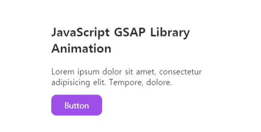
<h1>JavaScript GSAP Library Animation</h1>
<p>Lorem ipsum dolor sit amet, consectetur adipisicing elit. Tempore, dolore.</p>
<a href="#">Button</a>
</div>
</section>
<!-- GSAP JavaScript Library -->
<script src="https://cdnjs.cloudflare.com/ajax/libs/gsap/3.4.2/gsap.min.js"></script>
<!-- Custom JavaScript -->
<script src="./src/custom.js"></script>
</body>
</html>
style.css 파일을 다음과 같이 작성합니다.
* {
   margin: 0;
   padding: 0;
   box-sizing: border-box;
}

#title {
   width: 400px;
   margin: 300px auto;
}

.container {
   padding: 20px;
}

h1 {
   margin-bottom: 20px;
}

p {
   margin-bottom: 15px;
}

a {
   display: block;
   width: 100px;
   padding: 10px;
   background-color: blueviolet;
   text-decoration: none;
   color: white;
   text-align: center;
   border-radius: 10px;
}
custom.js 파일을 다음과 같이 작성합니다.
gsap.from('#title', {opacity: 0, duration: 1, y: -50});
preview:

위쪽으로 50px 위치한 곳에서 투명도가 0인 상태로 애니메이션이 시작되어 1초동안 투명도가 1인 상태로 애니메이션이 적용되는 것을 확인할 수 있습니다.
custom.js 파일을 gsap.from 대신 gsap.to로 바꾸면, 반대로 위쪽으로 50px 이동 후 사라지게 됩니다.
gsap.to('#title', {opacity: 0, duration: 1, y: -50});
preview:
이번에는 이동 속도 옵션인 ease에 대해서 알아보겠습니다.
ease에는 총 14개의 프리셋 옵션이 있고 커스터마이징해서 사용할 수 있습니다.
none, power1, power2, power3, power4, back, elastic, bounce, rough, slow, steps, circ, expo, sine
여기서는 14개의 프리셋 ease가 어떻게 움직이는지 한번 확인해 보겠습니다.
index.html 파일을 다음과 같이 작성합니다.
<!DOCTYPE html>
<html lang="en">
<head>
   <meta charset="UTF-8">
   <meta name="viewport" content="width=device-width, initial-scale=1.0">
   <title>Documents</title>
   <link rel="stylesheet" href="./src/style.css">
</head>
<body>

   <section id="title">
      <div class="box box1">none</div>
      <div class="box box2">power1</div>
      <div class="box box3">power2</div>
      <div class="box box4">power3</div>
      <div class="box box5">power4</div>
      <div class="box box6">back</div>
      <div class="box box7">elastic</div>
      <div class="box box8">bounce</div>
      <div class="box box9">rough</div>
      <div class="box box10">slow</div>
      <div class="box box11">steps</div>
      <div class="box box12">circ</div>
      <div class="box box13">expo</div>
      <div class="box box14">sine</div>
   </section>

   <!-- GSAP JavaScript Library -->
   <script src="https://cdnjs.cloudflare.com/ajax/libs/gsap/3.4.2/gsap.min.js"></script>

   <!-- Custom JavaScript -->
   <script src="./src/custom.js"></script>
</body>
</html>
style.css 파일을 다음과 같이 작성합니다.
* {
   margin: 0;
   padding: 0;
   box-sizing: border-box;
}

#title {
   width: 700px;
   margin: 100px auto;
}

.box {
   background-color: purple;
   width: 50px;
   height: 50px;
   border-radius: 50%;
   text-align: center;
   line-height: 50px;
   font-size: 12px;
}
custom.js 파일을 다음과 같이 작성합니다.
gsap.to('.box1', {x: 600, ease: 'none', duration: 5});
gsap.to('.box2', {x: 600, ease: 'power1', duration: 5});
gsap.to('.box3', {x: 600, ease: 'power2', duration: 5});
gsap.to('.box4', {x: 600, ease: 'power3', duration: 5});
gsap.to('.box5', {x: 600, ease: 'power4', duration: 5});
gsap.to('.box6', {x: 600, ease: 'back', duration: 5});
gsap.to('.box7', {x: 600, ease: 'elastic', duration: 5});
gsap.to('.box8', {x: 600, ease: 'bounce', duration: 5});
gsap.to('.box9', {x: 600, ease: 'rough', duration: 5});
gsap.to('.box10', {x: 600, ease: 'slow', duration: 5});
gsap.to('.box11', {x: 600, ease: 'steps(5)', duration: 5});
gsap.to('.box12', {x: 600, ease: 'circ', duration: 5});
gsap.to('.box13', {x: 600, ease: 'expo', duration: 5});
gsap.to('.box14', {x: 600, ease: 'sine', duration: 5});
ease 값을 power2.easeInOut 과 같이 변형해서 사용할 수 있고, elastic 같은 경우에는 elastic(1, 0.5) 으로 변형해서 사용할 수 있습니다.
preview:

이번에는 이미지를 우측 하단 모서리에 absolute 로 넣고 애니메이션을 추가해 보겠습니다.
index.html 파일을 다음과 같이 작성합니다.
<!DOCTYPE html>
<html lang="en">
<head>
   <meta charset="UTF-8">
   <meta name="viewport" content="width=device-width, initial-scale=1.0">
   <title>Documents</title>
   <link rel="stylesheet" href="./src/style.css">
</head>
<body>

   <section id="title">
      <div class="container">
         <h1>JavaScript GSAP Library Animation</h1>
         <p>Lorem ipsum dolor sit amet, consectetur adipisicing elit. Tempore, dolore.</p>
         <a href="#">Button</a>
      </div>
   </section>

   <section id="thumbnail">
      <img src="./src/unsplash-laptop.jpg" alt="laptop">
   </section>

   <!-- GSAP JavaScript Library -->
   <script src="https://cdnjs.cloudflare.com/ajax/libs/gsap/3.4.2/gsap.min.js"></script>

   <!-- Custom JavaScript -->
   <script src="./src/custom.js"></script>
</body>
</html>
style.css 파일을 다음과 같이 작성합니다.
* {
   margin: 0;
   padding: 0;
   box-sizing: border-box;
}

#title {
   width: 700px;
   margin: 100px auto;
}

.container {
   padding: 20px;
}

h1 {
   margin-bottom: 20px;
}

p {
   margin-bottom: 15px;
}

a {
   display: block;
   width: 100px;
   padding: 10px;
   background-color: blueviolet;
   text-decoration: none;
   color: white;
   text-align: center;
   border-radius: 10px;
}

#thumbnail{
   width: 420px;
   height: 300px;
   position: absolute;
   right: 0;
   bottom: 0;
}
custom.js 파일을 다음과 같이 작성합니다.
gsap.from('img', {x:300, y:200, opacity: 0, duration: 3});
preview:

preview를 보면 우측과 하단에 스크롤바가 보이는 것을 확인하실 수 있습니다.
이것을 안보이게 하려면, css 파일을 업데이트 해주는 데, body 태그에 overflow: hidden을 적용하면 스크롤바가 보이지 않게 해결할 수 있습니다.
모든 애니메이션이 동시에 적용되는데, 이번에는 시간차를 두고 애니메이션을 적용해 보겠습니다.
시간차를 두는 방법은 delay를 사용해서 애니메이션 시작하는 시간을 조정하시면 됩니다.
index.html 파일을 다음과 같이 작성합니다.
<!DOCTYPE html>
<html lang="en">
<head>
   <meta charset="UTF-8">
   <meta name="viewport" content="width=device-width, initial-scale=1.0">
   <title>Documents</title>
   <link rel="stylesheet" href="./src/style.css">
</head>
<body>

   <section id="title">
      <div class="container">
         <h1>JavaScript GSAP Library Animation</h1>
         <p>Lorem ipsum dolor sit amet, consectetur adipisicing elit. Tempore, dolore.</p>
         <a href="#">Button</a>
      </div>
   </section>

   <!-- GSAP JavaScript Library -->
   <script src="https://cdnjs.cloudflare.com/ajax/libs/gsap/3.4.2/gsap.min.js"></script>

   <!-- Custom JavaScript -->
   <script src="./src/custom.js"></script>
</body>
</html>
style.css 파일을 다음과 같이 작성합니다.
* {
   margin: 0;
   padding: 0;
   box-sizing: border-box;
}

#title {
   width: 700px;
   margin: 100px auto;
}

.container {
   padding: 20px;
}

h1 {
   margin-bottom: 20px;
}

p {
   margin-bottom: 15px;
}

a {
   display: block;
   width: 100px;
   padding: 10px;
   background-color: blueviolet;
   text-decoration: none;
   color: white;
   text-align: center;
   border-radius: 10px;
}
custom.js 파일을 다음과 같이 작성합니다.
gsap.from('h1',{y: 20, opacity: 0, duration: 1});
gsap.from('p',{y: 20, opacity: 0, duration: 1, delay: 1});
gsap.from('a',{y: 20, opacity: 0, duration: 1, delay: 2});
preview:

이번에는 동일한 클래스를 가지는 태그들을 일정한 시간차를 두고 애니메이션을 적용해 보겠습니다.
index.html을 다음과 같이 작성합니다. h1, p, a 태그에 animation1 클래스를 추가했습니다.
<!DOCTYPE html>
<html lang="en">
<head>
   <meta charset="UTF-8">
   <meta name="viewport" content="width=device-width, initial-scale=1.0">
   <title>Documents</title>
   <link rel="stylesheet" href="./src/style.css">
</head>
<body>

   <section id="title">
      <div class="container">
         <h1 class="animation1">JavaScript GSAP Library Animation</h1>
         <p class="animation1">Lorem ipsum dolor sit amet, consectetur adipisicing elit. Tempore, dolore.</p>
         <a class="animation1" href="#">Button</a>
      </div>
   </section>

   <!-- GSAP JavaScript Library -->
   <script src="https://cdnjs.cloudflare.com/ajax/libs/gsap/3.4.2/gsap.min.js"></script>

   <!-- Custom JavaScript -->
   <script src="./src/custom.js"></script>
</body>
</html>
style.css 파일을 다음과 같이 작성합니다.
* {
   margin: 0;
   padding: 0;
   box-sizing: border-box;
}

body {
   overflow: hidden;
}

#title {
   width: 700px;
   margin: 100px auto;
}

.container {
   padding: 20px;
}

h1 {
   margin-bottom: 20px;
}

p {
   margin-bottom: 15px;
}

a {
   display: block;
   width: 100px;
   padding: 10px;
   background-color: blueviolet;
   text-decoration: none;
   color: white;
   text-align: center;
   border-radius: 10px;
}

#thumbnail{
   width: 420px;
   height: 300px;
   position: absolute;
   right: 0;
   bottom: 0;
}
custom.js를 다음과 같이 작성합니다.
gsap.from('.animation1',{y: 20, opacity: 0, stagger: 0.5});
preview:

.animation1 클래스를 가진 태그들이 0.5초 간격으로 애니메이션 되는 것을 확인하실 수 있습니다.
다음으로는 Timeline에 대해서 알아보겠습니다.
동일한 클래스를 가지지 않더라도 chain 형식으로 순서대로 간격을 조정해서 애니메이션을 제어할 수 있습니다.
index.html을 다음과 같이 작성합니다.
<!DOCTYPE html>
<html lang="en">
<head>
   <meta charset="UTF-8">
   <meta name="viewport" content="width=device-width, initial-scale=1.0">
   <title>Documents</title>
   <link rel="stylesheet" href="./src/style.css">
</head>
<body>

   <section id="title">
      <div class="container">
         <h1 class="animation1">JavaScript GSAP Library Animation</h1>
         <p class="animation1">Lorem ipsum dolor sit amet, consectetur adipisicing elit. Tempore, dolore.</p>
         <a class="animation1" href="#">Button</a>
      </div>
   </section>

   <section id="thumbnail">
      <img src="./src/unsplash-laptop.jpg" alt="unsplash-laptop">
   </section>

   <!-- GSAP JavaScript Library -->
   <script src="https://cdnjs.cloudflare.com/ajax/libs/gsap/3.4.2/gsap.min.js"></script>

   <!-- Custom JavaScript -->
   <script src="./src/custom.js"></script>
</body>
</html>
style.css를 다음과 같이 작성합니다.
* {
   margin: 0;
   padding: 0;
   box-sizing: border-box;
}

body {
   overflow: hidden;
}

#title {
   width: 700px;
   margin: 100px auto 0;
}

.container {
   padding: 20px;
}

h1 {
   margin-bottom: 20px;
}

p {
   margin-bottom: 15px;
}

a {
   display: block;
   width: 100px;
   padding: 10px;
   background-color: blueviolet;
   text-decoration: none;
   color: white;
   text-align: center;
   border-radius: 10px;
}

#thumbnail{
   width: 700px;
   height: 300px;
   margin: 0 auto;
   padding: 20px;
}
custom.js 파일을 다음과 같이 작성합니다.
let t1 = gsap.timeline({defaults:{duration: 1}});

t1.from('h1', {y:-50, opacity: 0})
  .from('p',{y:-50, opacity: 0}, '-=0.5')
  .from('a',{y:-50, opacity: 0},'+=1')
  .from('img', {y: 200, opacity: 0},"-=0.5");
다른 코드와 달리 timeline 변수 t1으로 먼저 선언하고 기본값으로 1초의 간격을 두었습니다.
preview:

이번에는 버튼을 누르면 반대로 애니메이션이 적용 되도록 해보겠습니다.
index.html 파일을 다음과 같이 작성합니다. a 태그에 id cta 를 추가했습니다.
<!DOCTYPE html>
<html lang="en">
<head>
   <meta charset="UTF-8">
   <meta name="viewport" content="width=device-width, initial-scale=1.0">
   <title>Documents</title>
   <link rel="stylesheet" href="./src/style.css">
</head>
<body>

   <section id="title">
      <div class="container">
         <h1 class="animation1">JavaScript GSAP Library Animation</h1>
         <p class="animation1">Lorem ipsum dolor sit amet, consectetur adipisicing elit. Tempore, dolore.</p>
         <a id="cta" class="animation1" href="#">Button</a>
      </div>
   </section>

   <section id="thumbnail">
      <img src="./src/unsplash-laptop.jpg" alt="unsplash-laptop">
   </section>

   <!-- GSAP JavaScript Library -->
   <script src="https://cdnjs.cloudflare.com/ajax/libs/gsap/3.4.2/gsap.min.js"></script>

   <!-- Custom JavaScript -->
   <script src="./src/custom.js"></script>
</body>
</html>
style.css
* {
   margin: 0;
   padding: 0;
   box-sizing: border-box;
}

body {
   overflow: hidden;
}

#title {
   width: 700px;
   margin: 100px auto 0;
}

.container {
   padding: 20px;
}

h1 {
   margin-bottom: 20px;
}

p {
   margin-bottom: 15px;
}

a {
   display: block;
   width: 100px;
   padding: 10px;
   background-color: blueviolet;
   text-decoration: none;
   color: white;
   text-align: center;
   border-radius: 10px;
}

#thumbnail{
   width: 700px;
   height: 300px;
   margin: 0 auto;
   padding: 20px;
}
custom.js
let t1 = gsap.timeline({defaults:{duration: 1}});

t1.from('h1', {y:-50, opacity: 0})
  .from('p',{y:-50, opacity: 0}, '-=0.5')
  .from('a',{y:-50, opacity: 0},'-=0.5')
  .from('img', {y: 200, opacity: 0},"-=0.5");

document.getElementById('cta').addEventListener('click', () => {
   t1.reversed() ? t1.play() : t1.reverse();
});
preview:

마지막으로 GSAP 3 Cheat Sheet 입니다. 다양한 기능이 있으니 참고하시길 추천 드립니다.
https://greensock.com/cheatsheet/
GSAP 3 Cheat Sheet
This GSAP 3 cheat sheet is an invaluable quick-reference guide to the API with links to more in-depth documentation for the properties and methods.
greensock.com
이렇게 이번 시간에는 GSAP 라이브러리를 사용해서 애니메이션을 추가하는 방법에 대해서 알아봤습니다.
유용하셨다면, 공감과 구독 부탁 드립니다.
감사합니다.


댓글